
How does color influence your brand’s perception in the B2B world? The psychology of color in B2B branding plays a crucial role in shaping cultural considerations, as men of all ages often think outside the black box. Different colors evoke various emotions and associations, impacting how businesses connect with their audience. For instance, blue often symbolizes trust, while red can signify urgency.
Understanding these nuances helps brands tailor their messaging to resonate with diverse cultural backgrounds. This post dives deep into the significance of color choices and their psychological effects on branding strategies. Discover how to leverage color effectively for better engagement and stronger brand identity in the B2B landscape.
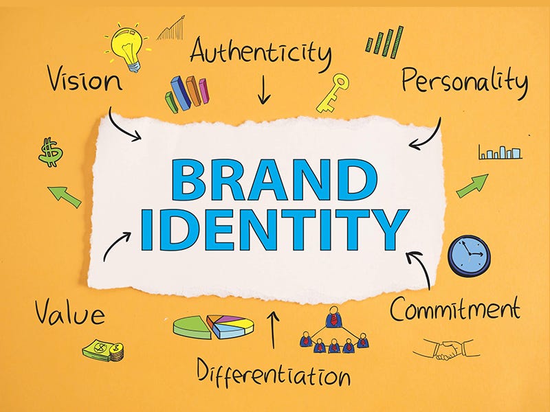
Key Takeaways
- Color plays a vital role in B2B branding, influencing perceptions and decision-making. Use colors that resonate with your target audience to enhance brand recognition.
- Understanding color psychology can help you choose the right colors for your branding. Research how different colors evoke emotions and align with your brand values.
- Cultural influences significantly affect color choices. Be aware of cultural meanings associated with colors in different regions to avoid misinterpretation.
- Implement effective strategies for color selection by testing various color palettes and gathering feedback from your audience to determine what works best.
- Stay updated on current trends in branding colors to ensure your brand remains relevant and appealing in a competitive market.
- Differentiate your brand by using unique color schemes that stand out from competitors, while ensuring they reflect your brand identity and message.
Importance of Color in B2B Branding
Emotional Influence
Color plays a significant role in influencing emotional responses. In B2B branding, this effect can guide decision-making. For example, blue often conveys trust and reliability. Many companies, like Mailchimp, use this color to build confidence with their clients. Green tends to signal growth and energy. This is why brands in finance or sustainability may lean towards these colors.
Colors can also evoke specific feelings. Red might create urgency and excitement. This can be useful for promotions or limited-time offers. Understanding these emotional triggers helps businesses connect better with their audience.
Subjective Perception
Color perception varies by culture and personal experiences. What one group finds appealing, another may not. For instance, white symbolizes purity in Western cultures but can represent mourning in some Eastern cultures. Brands must consider these differences when choosing colors.
This subjectivity can lead to misinterpretations. A color that works well in one market may fail in another. Therefore, conducting research on target audiences is essential. It ensures that the chosen colors resonate positively.
Accessibility Considerations
Accessibility must be a priority in color choices. Approximately 1 in 12 men and 1 in 200 women experience some form of color blindness. This condition affects how individuals perceive color combinations. Using colors that are distinguishable for everyone is vital.
Brands should avoid relying solely on color for important information. Instead, they can use patterns or labels alongside colors to convey messages clearly. This approach ensures all users can engage with the brand equally.
Huge Opportunity
Ignoring color psychology presents a huge opportunity lost for B2B brands. An effective color strategy enhances brand recognition and loyalty. Brands that understand and implement this knowledge gain a competitive edge.
Research shows that color increases brand recognition by up to 80%. This statistic highlights the importance of thoughtful color selection in branding strategies.
Understanding Color Psychology
Color Associations
Color psychology explores the meanings behind different colors. Each color evokes specific emotions and reactions. For example, blue often represents trust and reliability. Many businesses use blue in their branding to foster a sense of security.
On the other hand, red can evoke excitement or urgency. Companies may use red to grab attention during sales. Colors like green are linked to growth and health. This makes green popular among brands focused on sustainability.
Context Matters
The context in which colors are used significantly impacts their emotional effect. A color’s meaning can change based on cultural backgrounds. For instance, white symbolizes purity in Western cultures but represents mourning in some Eastern cultures.
Branding must consider these cultural nuances. A color that works well in one market may not resonate in another. Companies should research local preferences before finalizing their color schemes.
Psychological Effects
Colors influence consumer behavior and brand loyalty. Studies show that people make quick judgments about products based on color within seconds. A strong visual identity can lead to higher brand recognition.
For instance, brands that consistently use specific colors tend to build stronger emotional connections with customers. The color wheel helps marketers understand how colors relate to each other and how they can be combined effectively.
Emotional Impact
Different shades can also alter perceptions. Darker shades may convey sophistication, while lighter shades might suggest playfulness. The color spectrum provides a range of options for brands to choose from.
Understanding how consumers perceive colors can guide marketing strategies. Brands that align their color choices with their messaging can create more impactful campaigns.
Color Guidelines
Businesses should follow certain guidelines when using color in branding. They should consider the target audience’s preferences and cultural backgrounds. Testing various color combinations can reveal which ones resonate best with consumers.
A well-thought-out approach to color psychology can help companies stand out in competitive markets. It can enhance brand loyalty by creating positive associations with the brand.
Cultural Influences on Color Choices
Color Associations
Colors carry different meanings across cultures. For example, blue tones often symbolize trust and reliability in Western countries. In contrast, in some Eastern cultures, blue can represent mourning.
Yellow is another color with varied interpretations. In many Western contexts, yellow signifies happiness and warmth. However, in certain regions of Asia, it can be associated with caution or even dishonor.
Stereotypical Color Associations
Stereotypical color associations play a significant role in branding. For instance, certain colors like red are often linked to excitement and energy. Many brands use red to attract attention. Yet, in some cultures, red can also signify danger or warning.
Pink is typically viewed as a feminine color in the West. This perception influences marketing strategies for products aimed at women. However, in other cultures, pink may not hold the same significance.
Case Studies
Case studies highlight the need for cultural sensitivity in color selection. A well-known example is when Coca-Cola launched its product in China. The company initially used white packaging, which is associated with death there. After realizing this mistake, Coca-Cola switched to red packaging to align with local preferences.
Another case involves a tech company that chose beige for its branding in Europe. While beige is often seen as neutral and safe, it failed to resonate with consumers who preferred bolder colors. The brand then shifted to brighter hues and saw an increase in engagement.
Color Appropriateness
Color appropriateness varies by region and industry. In finance, blue is commonly used due to its associations with stability and trustworthiness. Meanwhile, creative industries may use more vibrant colors like magenta or yellow to convey innovation.
Understanding these nuances helps businesses avoid missteps in their branding strategies. Choosing the right palette can enhance brand perception and customer connection.
Cultural Beliefs
Cultural beliefs significantly affect how people interpret colors. For example, while green represents growth and prosperity in many cultures, it can also symbolize jealousy or greed elsewhere. Brands must consider these implications when developing their visual identities.
Moreover, cultural context shapes emotional responses to colors. Certain hues may inspire confidence or fear depending on local customs and values. Companies should research these aspects before finalizing their color choices.
Effective Strategies for Color Selection
Choosing Colors
Brand identity relies heavily on choosing colors that resonate with the target audience. Different cultures interpret colors in unique ways. For example, red may symbolize luck in China but can represent danger or warning in Western cultures. Understanding these meanings is crucial when developing a color palette.
A framework for selecting colors should begin with defining the brand’s core values. Identify what emotions the brand wants to evoke. This helps narrow down appropriate colors that align with those feelings. For instance, blue often conveys trust and reliability. Brands aiming for a professional image might include various shades of blue in their visual design.
Considering Color
Considering color also involves research into the target audience’s preferences. Surveys and focus groups can provide insights into how potential customers perceive different colors. This feedback can guide choices and ensure they resonate well with the intended audience.
Testing methods are essential to gauge reactions to color choices. A/B testing can be effective when introducing new branding materials. By presenting two versions of a design—one with a specific color scheme and another with an alternative—brands can analyze which option performs better. This data-driven approach enhances the user experience and increases engagement.
Color Palette
Creating a consistent color palette is vital for maintaining brand integrity. Consistency helps build recognition and trust among consumers. Guidelines should be established for using colors across all branding materials, including websites, social media, and print advertisements.
The color palette should include primary and secondary colors. Primary colors form the foundation of the brand’s identity, while secondary colors add flexibility and variety. For instance, a company might choose navy as its primary color for professionalism, complemented by lighter shades like sky blue or gray for additional materials.
Accessibility
Accessibility must be part of any discussion about color selection. Ensure that chosen colors meet contrast guidelines to support users with visual impairments. Tools are available to check color contrast ratios effectively. These tools help brands avoid combinations that may be difficult for some audiences to read.
Incorporating accessibility considerations improves overall user experience. It demonstrates a commitment to inclusivity and enhances brand reputation.
Success Over Time
The success of color choices will not be immediate; it requires time and evaluation. Regularly revisit the effectiveness of current colors in relation to evolving cultural trends and customer feedback. Adjusting strategies based on these insights ensures longevity in branding efforts.
Current Trends in Branding Colors
Iconic Brand Colors
Many brands leverage iconic colors to create strong identities. Red, for instance, often represents energy and excitement. Brands like Coca-Cola and Target effectively use red to attract attention.
Blue remains a popular choice across various industries. In the tech world, many companies opt for shades of blue to convey trust and security. Microsoft, IBM, and Facebook have all adopted tech blue in their branding. This color choice resonates with consumers looking for reliability.
Common Industry Colors
Different industries tend to favor specific colors. For example, green is common in the health and wellness sector. It symbolizes growth and freshness. Brands like Whole Foods and Tropicana use green to reflect their commitment to healthy living.
In contrast, the finance industry often uses blue and gray. These colors suggest professionalism and stability. Companies like American Express and JPMorgan Chase utilize these hues to build consumer confidence.
Overused Blue
Despite its effectiveness, blue has become an overused color in marketing. Many brands flock to this shade without considering alternatives. This saturation can dilute brand identity and make it harder for companies to stand out.
To counteract this trend, some brands are experimenting with bolder colors. Bright yellows or vibrant oranges can catch the eye in a crowded market. Such choices can differentiate a brand from competitors who stick to traditional palettes.
Cultural Considerations
Cultural shifts play a significant role in shaping color preferences. Social movements often influence how consumers perceive certain colors. For instance, the rise of sustainability has led many brands to adopt earthy tones like browns and greens.
Brands must be sensitive to these changes. Adapting branding strategies to reflect cultural values is crucial. A company that ignores these shifts risks alienating its audience.
Adapting Strategies
Successful brands monitor emerging color trends closely. They adapt their strategies while maintaining brand integrity. Incorporating trending colors can enhance relevance without compromising the brand’s core message.
For example, a tech company may choose to integrate a trendy shade of purple into its branding materials while keeping its logo intact. This approach allows it to remain fresh while still being recognizable.
Differentiating Brands Through Color
Unique Palettes
Brands use unique color palettes to stand out in competitive markets. Distinctive colors capture attention and create a memorable identity. For example, tech brands often rely on blue. This color conveys trust and reliability. Yet, companies can break the mold by choosing unexpected hues.
Burgundy is one such color. It evokes feelings of sophistication and luxury. Brands that adopt this shade can differentiate themselves from competitors. By doing so, they appeal to a niche market seeking exclusivity.
Visual Cues
Using color as a visual cue enhances brand recognition. Research shows that consumers recognize brands faster when they see their specific colors. For instance, the red of Coca-Cola is instantly recognizable. This brand color has become synonymous with the company itself.
Common brand colors like green are popular for eco-friendly businesses. These choices reflect values tied to sustainability. By aligning color with brand message, companies strengthen their identity in the marketplace.

Unconventional Choices
Experimenting with unconventional color choices can challenge industry norms. Many brands stick to traditional colors for fear of alienating customers. However, bold decisions can attract attention and create buzz.
For example, a financial services firm might choose a vibrant orange instead of the typical blue or gray. This powerful color choice sets it apart and signals innovation in a conservative field.
Brands should not shy away from using tough colors either. Darker shades can convey strength and authority, appealing to certain audiences.
Cultural Considerations
Cultural differences impact how people perceive colors. What works in one region may not resonate in another. For instance, white symbolizes purity in Western cultures but represents mourning in some Eastern cultures. Brands must understand these meanings when selecting their brand color choice.
By considering cultural context, brands avoid missteps that could damage their reputation. A thoughtful approach to marketing colors ensures messages align with local expectations.
Brand Experience
The overall brand experience heavily relies on effective color usage. Colors influence emotions and behaviors at a subconscious level. Brands that leverage this knowledge create deeper connections with customers.
Colors affect purchasing decisions too. Studies reveal that up to 90% of snap judgments about products are made based on color alone. This statistic highlights the importance of strategic branding through color.
Significance of Cool Colors
Calming Effects
Cool colors, such as blue and green, have a calming effect. They can create a sense of peace and tranquility. Research shows that these colors lower stress levels. Businesses often use them to ease client anxiety. This is especially important in high-stakes B2B environments. Clients feel more relaxed when they see cool colors. As a result, they are more open to communication and collaboration.
Using cool colors can enhance brand perception. Companies that adopt these hues often appear more approachable. Clients associate these colors with stability and reliability. For example, many tech companies use blue in their branding. This choice reflects trustworthiness and professionalism.
Professionalism and Trustworthiness
Cool colors convey professionalism effectively. They communicate a sense of order and control. In B2B branding, this is crucial for establishing credibility. Brands that utilize these colors often gain client confidence quickly.
Studies indicate that blue, in particular, is linked to trust. Companies like IBM and Dell have successfully used blue to build their brands. These brands are recognized for their dependability and expertise. Green also plays a role in promoting sustainability. This resonates well with businesses focused on eco-friendly practices.
Choosing the right shade matters too. Lighter shades can appear friendly, while darker shades suggest authority. Striking the right balance is essential for B2B branding success.
Creating Inviting Atmospheres
Cool colors help create serene atmospheres for brands. They invite clients into a space that feels safe and welcoming. This is particularly true in office environments or online platforms.
Many businesses incorporate these colors into their designs. Websites with cool color schemes tend to keep visitors engaged longer. A calm visual experience encourages exploration of products or services.
For instance, a consulting firm might use soft blues in its office decor. This creates an inviting environment for meetings and discussions. Clients feel at ease, which fosters better conversations.
Impact of Warm Colors
Energetic Color
Warm colors, such as red, orange, and yellow, are known for their energizing qualities. These colors can stimulate feelings of excitement and enthusiasm. Businesses often use them in branding to grab attention. For example, many fast-food chains use red and yellow to create a sense of urgency. This strategy encourages customers to make quick decisions.
Warm colors also evoke strong emotions. Red can symbolize passion or love, while orange is often associated with creativity and warmth. These associations can help brands connect with their audience on a deeper level. When used effectively, warm colors can enhance brand identity and increase customer engagement.
Effect on Marketing
The effect of warm colors extends beyond just evoking feelings. They can also foster a sense of urgency in marketing materials. Bright reds and oranges prompt immediate action. This is why sales promotions often feature these hues prominently.
For instance, a limited-time offer might be highlighted in bold red text. This encourages consumers to act quickly before the deal expires. The psychological impact of these colors can lead to increased conversion rates for businesses.
However, overuse of warm colors may backfire. Too much red or orange can overwhelm the viewer. It may lead to feelings of anxiety instead of excitement. Finding the right balance is crucial for effective branding.
Cultural Considerations
Cultural implications play a significant role in how warm colors are perceived. Different regions may interpret these colors differently. For example, in Western cultures, red often represents love and passion. In contrast, in some Asian cultures, it symbolizes good fortune and happiness.
Understanding these cultural nuances is essential for global brands. A color that works well in one market may not resonate in another. Companies should conduct research to understand local preferences before launching campaigns.
For instance, a brand looking to expand into China might emphasize red in its marketing materials. This aligns with local beliefs about prosperity and joy. Conversely, they may choose more subdued colors for markets where warm tones are less favored.
In summary, the psychology of warm colors plays an important role in B2B branding. Their energetic nature can inspire enthusiasm and action among consumers. However, brands must consider cultural differences when using these colors. Successfully integrating warm colors into branding requires careful thought and planning.
Role of Neutral Colors
Definition and Function
Neutral colors play a significant role in branding. They help establish a balanced and sophisticated brand image. Neutrals like beige, gray, and white provide a clean canvas. This allows other colors to stand out without overwhelming the viewer. Brands often choose neutrals to convey professionalism and stability. For example, many financial institutions use gray and white to reflect trustworthiness.
Backdrop for Vibrant Accents
Neutral colors can serve as an effective backdrop for more vibrant accents in branding. By using a neutral base, companies can highlight their main message or product. Bright colors draw attention and create visual interest against a neutral background. For instance, a tech company might use a sleek gray website with bright blue buttons. This contrast captures attention while maintaining a modern look.
Versatility Across Industries
The versatility of neutral colors appeals to diverse audiences and industries. Many brands incorporate neutrals into their marketing strategies to reach various demographics. A fashion brand might use soft taupe to attract a younger audience while keeping it classy. Meanwhile, a healthcare provider may opt for light gray to evoke calmness and safety.
Neutral colors fit well in different settings and cultures too. In some cultures, white symbolizes purity or new beginnings. In others, it may represent mourning. Understanding these cultural nuances is crucial for B2B branding. Businesses must consider how their color choices resonate with their target audience.
Emotional Impact
Using neutral colors can also have an emotional impact on consumers. They often evoke feelings of calmness and reassurance. This is beneficial for brands that want to build long-term relationships with clients. For example, many wellness brands utilize soft neutrals to create a soothing atmosphere.
Balance in Branding
Achieving balance in branding is essential for success. Neutral colors help maintain this balance by complementing other shades used in marketing materials. They allow brands to communicate effectively without being overly aggressive or flashy. A well-balanced color scheme enhances readability and user experience.
Cierre de Pensamientos
Understanding the psychology of color in B2B branding is crucial for your success. Colors influence perception, emotions, and even purchasing decisions. You’ve seen how cultural factors shape these choices. By applying effective strategies, you can differentiate your brand in a crowded market.
Stay ahead by keeping an eye on current trends and adapting your color palette accordingly. Don’t underestimate the power of cool, warm, and neutral colors. They can make or break your brand identity. Take action now—evaluate your current branding and consider how color can enhance your message. Embrace the psychology of color to elevate your B2B branding game.
Frequently Asked Questions
What is the importance of color in B2B branding?
Color influences perception and decision-making. In B2B branding, it helps convey values and differentiate from competitors, enhancing brand recognition and trust.
How does color psychology affect branding?
Color psychology affects emotions and behaviors. Different colors evoke specific feelings, which can impact how clients perceive a brand’s reliability and professionalism.
Why are cultural considerations important in color choice?
Cultural meanings of colors vary globally. Understanding these differences ensures your branding resonates positively with diverse audiences, avoiding misinterpretations or negative associations.
What are effective strategies for selecting brand colors?
Choose colors that align with your brand identity and target audience. Test combinations for visual appeal and ensure consistency across all platforms to reinforce brand recognition.
What current trends are shaping branding colors?
Trends include bold palettes, gradients, and earthy tones. Brands are shifting towards authenticity, sustainability, and inclusivity, reflected in their color choices.
How can brands differentiate themselves through color?
Unique color schemes create memorable identities. Consistent use of distinct colors helps establish a strong presence, making it easier for customers to recognize and remember your brand.
What roles do cool, warm, and neutral colors play in branding?
Cool colors evoke calmness and professionalism. Warm colors inspire energy and enthusiasm. Neutral colors provide balance, ensuring versatility while maintaining a clean aesthetic.